Tuesday, 12 November 2013
My Evaluation
My media product uses the codes and conventions of a front cover because it has a set theme running through it, red, whit and black. This magazine is also unisex, which most aren't, but being a school magazine i feel that it had to appeal to both genders.
The institution that might distribute my media product would have to be the school (Highdown) because it is a magazine written for them by the students of that place. It could also be distributed around the local community, involving them in the schools activities and advertising the school so people would want to enroll.
The audience for my Magazine is mainly the senior school, since it is a mature and professional looking product but also relates to the students and isn't patronizing.
One of the ways we attract our audience is by the front cover, it is simple but not plain, and professional looking.
I have learnt how to use the basics of Photoshop, taking various pictures and how to create and write a blog.
Monday, 11 November 2013


Wednesday, 6 November 2013


Contents Page analysis- Vogue
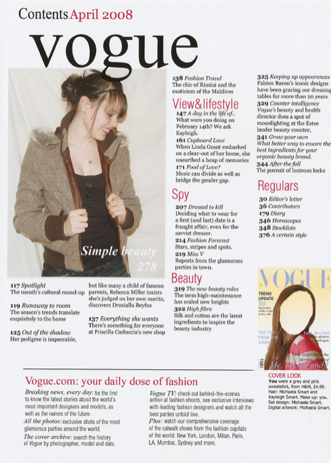
The thing that stands out on the contents page the most are the pictures, these are used to draw the readers attention visually. Although there are only two pictures, they show us who the audience is, women. The next thing that would catch the readers eyes would be the red sub-headings. The Different pages are split up into sub categories so that the reader can look for what they want to read quicker, which is more convenient.
It has a colour theme to it which it good because it looks organised and sophisticated. The colours arn't over girly either so it suggests that this is aimed at women and not girls.
Colour Testing

Yellow suggests optimism and happiness, this is because it is a bright colour and it resembles the colour of the sun and life. Some people might not like yellow because it is too bright therefore it might be hard to read.
Orange could symbolizes happiness and warmth and could also resemble the sun. It is a cheerful sociable colour, this could suggest that this is a very childish and child friendly.
Red symbolizes love and passion or danger and fire. it is often used on street signs. It stands out and is attention grabbing.
Light Red (Pink) is considered to be a very girly colour, often used for girls 16 and under. It is also another colour that is commonly used to symbloises love, compassion and nurturing. It has the power of red but softens it with the white.
Purple represents balance, the mixing of a hot/loud colour(red) and a cold/quiet colour(blue). It is an optimistic colour, symbolising happiness and contentment. It is a colour that could be applied to both genders, being feminine and masculine at the same time, appealing to everyone.
Green is the colour of growth, health and wealth. It is considered a male colour but can be either unisex dependsing on the shade of green. The mixing of Blue and Green makes Turquoise, a very desirable colour.
Thursday, 17 October 2013

Wednesday, 16 October 2013
Font testing for the School Magazine

American typewriter- This font is simple and easy to read, but not overly simple that it is patronising, therefore think this font would work well on the front of a secondary school student magazine.
Apple casual- This font is very simple and playful, but it is over simplified so putting it on a student magazine for secondary school students would be a bit patronising. It could be suited better to a primary school magazine because it would apply better to the age group.
Bank gothic- As this font is in all capitals and quite bold, it would make a good masthead for a magazine front cover. It is also well spaced out so it is easy to understand and read. However it looks quite rigid and boxy so it wouldn't look right on a student magazine front cover but rather a business magazine or computer magazine.
Bauhaus- This font is very simple and stylish in a way, it has an 'art deco' feel to it. It is evenly spaced out and very round. Because of its stylish nature I think it is more suited to a music or art magazine rather than a student magazine.
Brush script- This font mimics handwriting and therefore some people may not be able to understand it that well as it is quite small and not spaced out. So I do not think it would be a good font for the school magazine. It could suit other magazines for example a feminine one like women's fashion or a music or art magazine.
Mesquite std- This magazine has a cowboy theme to it because of its style. It is tightly spaced together so it is not easy to read but it is in all capitals so it could be used as a masthead for certain magazines for example a music magazine. I don't think it is suitable for a school magazine though.
Party LED- This is another font that is in a handwritten style but it is more spaced out but is maybe more difficult to understand because it is very curly and the lower case letters are quite small. It would suit a magazine with a Halloween feel to it but not a school magazine.
Desdemonda- This font has an 'Aztec' feel to it. It is in all capitals and evenly spaced out so it would make a good masthead. But it is not filled in so it wouldn't be very bold. I don't think it would be good as the magazine font for a school magazine.
Saturday, 5 October 2013
Questionnaire answer statistics


My data suggests that this school educates both sexes, this information tells me that it wouldn't be appropriate to aim the magazine at just one gender. Therefore I will aim the magazine at both sexes.
My data suggests that the people who will read this magazine will be from the senior school. This tells me that it should be aimed at an older audience, therefore I will aim it at the senior school.


Friday, 4 October 2013
Questionnaire for Target Audience(blank copy)
School Magazine Questionnaire
As part of Media Studies coursework I have to design a school magazine for the students. I want to know who my Target Audience is and what they want in a school magazine. Here is the link for my survey on 'survey monkey' http://www.surveymonkey.com/s/NXFZRP21) Are you a Male or Female?
- Male
- Female
- 7
- 8
- 9
- 10
- 11
- 12
- 13
- Yes
- No
- Yes
- No
- Under £1
- More than £1
- More than £2
- Spring
- Summer
- Autumn
- Winter
- Casually
- Formally
- Annually
- Monthly
- Sports
- Advice
- Whats new?
- Events
- Music
- Statistics
- Competitions
- Questionnaires within the magazines
- Film
___________________________________________________________________________
___________________________________________________________________________
___________________________________________________________________________
Hampton School magazine- The Lion

The masthead of the magazine is very simple and makes a statement by being in capital letters. This suggests that the image they wants to portray is uncomplicated. 'THE LION' stands for the lion on the school logo, since this is a school magazine.
On the front cover it shows someone who is probably a student. This shows that this magazine is from the students to the students which I think is the best way to reach out to them because it feels more familiar and casual.
The student on the cover looks like to be doing some sort of climbing activity. this send out a positive image of the students, showing that they are outgoing and active- not only intelligent. It also shows the kinda of activities that the school offers and encourages people to do.
The colours used on the cover are simple and stand out. The two main colours used are a blueish-grey and an orangey-yellow. Even though there is just a hint of the orange colour they both complement each other and then works as the title and writing colour because it matches the helmet and the bag cover. Both of the colours aren't particularly feminine, this could be because the magazine is from an all-boys school.
The font they have used is very simple and the magazine title is all in capitals, but it is translucent which makes it softer, so it doesn't look so harsh against the background. The same effect is given to the school logo and the dates.
Thursday, 3 October 2013
Hampton School magazine- Parallel Lions
 Parallel Lions- Summer 2012
Above all, is the school logo, and under it is the mast head 'PARALLEL LIONS'. This gives inportance to the logo showing that it is a school magazine. It is very big, in capital letters but it isn't entirely bold because that would be too overpowering on the page.
The image on the front cover is of the world, made up by the Greek alphabet. This could symbolise the knowledge of the world, so this magazine isn't necessarily about people but about worldly issues or stories.
The same kind of colours are used but the colour that stands out and is different is the yellow of the school logo. This shows the significance of it.
There are two different fonts that are used on this front cover. One looks more formal and professional. The other is more of an understatement and is just there for information purposes.
Monday, 30 September 2013
Magazine cover analysis- PC GAMER

Magazine cover analysis- PC Gamer
The title of this magazine is pretty self explanatory, the audience are gamers. It is in block capitals which shows the importance and makes a statement. Also the colours black read and white stand out and with the words in different colours.
Fittingly, the images that are on the cover are taken from games, advertising them, relating to what's written inside. Both of the images on there slightly overlap the masthead, this gives the illusion of it being on top on it, giving it depth as though it is in 3D. The figures are both recognizable to gamers which is why it is on the front cover. This re-enforces the fact that this is a magazine from the gamers to the gamers. The images are also different in the sense that one is pixelated and looks like something off a computer game whether the other is a cartoon. This also adds depth and variety so you don't feel like you're looking at the same kind of thing on the cover.
The colours used on the cover are bright and bold, and there are a lot of them, but there doesn't seem to be any feminine colours on there so this suggests that this magazines audience base is primarily boys/men.
All of the words that need emphasis are in capital letters. this is stuff like titles, names of games and extra features. This draws attentions to them and then you read the writing underneath in lowercase letters, finding out more information.
Certain words are used to tempt the reader into the magazine for example, 'Expert guide' 'We reveal the secrets of...' 'How to be'. All of this language are designed to make the reader buy into the magazine so they can read these articles, even if they're an exaggeration. It also uses language that only a gamer would know so it shows that this is a magazine for the experienced and someone who knows about games. Wheather it be a quote or specialist vocabulary like "I made a dragon komodo into a bag :(" This could be referencing a moment in the game or a joke within the game that everyone who has played it has encountered. 'Indie game' is another one, some people didn't know that it was an actual genre of the game, maybe its just been invented or it is a new era of gaming that is referred to as indie, but this is why this magazine is not for novices and is the 'real deal' so to speak.
Sunday, 29 September 2013
Magazine cover analysis- ASOS

Asos is a fashion magazine, the word itself doesn't mean anything, its a brand name and maybe that's why its become so popular. It is short and simple, maybe reflecting the brands identity, but very big on the page. Nothing is covering it is filled in with bright bold colours which shows its importance. As well as the colours, it has a graffiti like design or writing and gradients within that could duplicate the effect of spray pains or stencils which shows individuality and the fact that it is urban and artistic.
Although this is firstly a fashion magazine, the people on the front cover are the popular girl group 'Haim' so it has music features within the magazine which then amplifies the interest. They are placed centrally and are all close together which shows union, family and friendship, it also makes it seem more relate able and casual and not intimidating like maybe other celebrities are portrayed for example super models.
There aren't any other pictures on the cover which draws more attention to 'Haim'. The other headlines are presented like headlines at a music festival which relates to the time this magazine was issued- in the summer- and is probably also why the girl group is on the front cover. Just under the masthead it reads 'summer smash hits' so this relates back to the festival season were both music and fashion is important. On one side it has names of the upcoming, new and fashionable bands and on the other side it has styles of clothing that are in fashion at that time. This re-enforces the fact that this is a fashion magazine with a music theme, and maybe the music side is bigger due to the fact that it is festival season...
The colours used on the front cover are pink, yellow, black and purple. This symbolises that this is a magazine for girls/women. Also the picture of 'Haim' stands for girl power, they are wearing black and white colours against a pale blue background to make the colours of the writing stand out so they complement each other.
Everything on the cover is in capitals except for the masthead, this makes it stand out. Its a kind of contradiction too because usually we use capitals to emphasize some thing but because the masthead isn't in capitals, its set apart and draws attention to itself. This reflect the type of magazine they aim to be- they stand out but not the stereotypically. They're different.
The titles and writing used on the cover are hardly sentences, they're short and snappy, to the point. This makes everything simple and doesn't give too much away so people would want to read inside. The mention of a popular TV drama 'game of thrones' could tempt the reader into reading as well as the fashion and music features.
Friday, 27 September 2013
Subscribe to:
Comments (Atom)