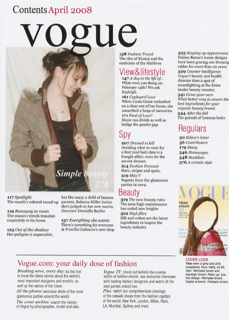
The thing that stands out on the contents page the most are the pictures, these are used to draw the readers attention visually. Although there are only two pictures, they show us who the audience is, women. The next thing that would catch the readers eyes would be the red sub-headings. The Different pages are split up into sub categories so that the reader can look for what they want to read quicker, which is more convenient.
It has a colour theme to it which it good because it looks organised and sophisticated. The colours arn't over girly either so it suggests that this is aimed at women and not girls.
No comments:
Post a Comment