 Parallel Lions- Summer 2012
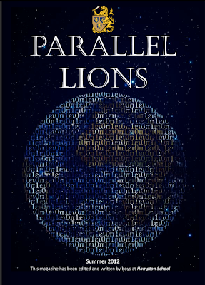
Above all, is the school logo, and under it is the mast head 'PARALLEL LIONS'. This gives inportance to the logo showing that it is a school magazine. It is very big, in capital letters but it isn't entirely bold because that would be too overpowering on the page.
The image on the front cover is of the world, made up by the Greek alphabet. This could symbolise the knowledge of the world, so this magazine isn't necessarily about people but about worldly issues or stories.
The same kind of colours are used but the colour that stands out and is different is the yellow of the school logo. This shows the significance of it.
There are two different fonts that are used on this front cover. One looks more formal and professional. The other is more of an understatement and is just there for information purposes.
No comments:
Post a Comment