Thursday, 17 October 2013
Wednesday, 16 October 2013
Font testing for the School Magazine
American typewriter- This font is simple and easy to read, but not overly simple that it is patronising, therefore think this font would work well on the front of a secondary school student magazine.
Apple casual- This font is very simple and playful, but it is over simplified so putting it on a student magazine for secondary school students would be a bit patronising. It could be suited better to a primary school magazine because it would apply better to the age group.
Bank gothic- As this font is in all capitals and quite bold, it would make a good masthead for a magazine front cover. It is also well spaced out so it is easy to understand and read. However it looks quite rigid and boxy so it wouldn't look right on a student magazine front cover but rather a business magazine or computer magazine.
Bauhaus- This font is very simple and stylish in a way, it has an 'art deco' feel to it. It is evenly spaced out and very round. Because of its stylish nature I think it is more suited to a music or art magazine rather than a student magazine.
Brush script- This font mimics handwriting and therefore some people may not be able to understand it that well as it is quite small and not spaced out. So I do not think it would be a good font for the school magazine. It could suit other magazines for example a feminine one like women's fashion or a music or art magazine.
Mesquite std- This magazine has a cowboy theme to it because of its style. It is tightly spaced together so it is not easy to read but it is in all capitals so it could be used as a masthead for certain magazines for example a music magazine. I don't think it is suitable for a school magazine though.
Party LED- This is another font that is in a handwritten style but it is more spaced out but is maybe more difficult to understand because it is very curly and the lower case letters are quite small. It would suit a magazine with a Halloween feel to it but not a school magazine.
Desdemonda- This font has an 'Aztec' feel to it. It is in all capitals and evenly spaced out so it would make a good masthead. But it is not filled in so it wouldn't be very bold. I don't think it would be good as the magazine font for a school magazine.
Saturday, 5 October 2013
Questionnaire answer statistics

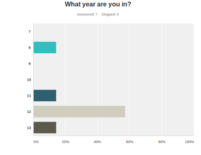
My data suggests that this school educates both sexes, this information tells me that it wouldn't be appropriate to aim the magazine at just one gender. Therefore I will aim the magazine at both sexes.
My data suggests that the people who will read this magazine will be from the senior school. This tells me that it should be aimed at an older audience, therefore I will aim it at the senior school.
My results show that the majority of people read magazines.
My data suggests that the number of people who would pay for a school magazine is almost even with the number of people who said they wouldn't. This information tells me that I could either make the magazines free or charge very little. Therefore I wont charge people for the magazine.
Due to the results of question 4, I would not charge people for this magazine.
My data suggests that Summer would be the bet season to release the magazine. So it shall be released in the Summer time before the holidays.
As this is a student magazine, written by students, most of the responses prefer that it be written in a casual tone.
most of the responses want the magazine to be released monthly, but in 6, the audience wanted it to be summer. To compromise the demands of the demands of the audience, I think the magazine should be released every season, four times a year.
The interests of the audience varies, there are so many things that they would like to read so all of the things that they have chosen will be a part of the magazine.
There are many colours that people think are unisex, but the ones that pop up often are: black, white and red. Therefore black white and red will be my theme for the magazine.
Friday, 4 October 2013
Questionnaire for Target Audience(blank copy)
School Magazine Questionnaire
As part of Media Studies coursework I have to design a school magazine for the students. I want to know who my Target Audience is and what they want in a school magazine. Here is the link for my survey on 'survey monkey' http://www.surveymonkey.com/s/NXFZRP21) Are you a Male or Female?
- Male
- Female
- 7
- 8
- 9
- 10
- 11
- 12
- 13
- Yes
- No
- Yes
- No
- Under £1
- More than £1
- More than £2
- Spring
- Summer
- Autumn
- Winter
- Casually
- Formally
- Annually
- Monthly
- Sports
- Advice
- Whats new?
- Events
- Music
- Statistics
- Competitions
- Questionnaires within the magazines
- Film
___________________________________________________________________________
___________________________________________________________________________
___________________________________________________________________________
Hampton School magazine- The Lion
The Lion- 2011 & 2012
The masthead of the magazine is very simple and makes a statement by being in capital letters. This suggests that the image they wants to portray is uncomplicated. 'THE LION' stands for the lion on the school logo, since this is a school magazine.
On the front cover it shows someone who is probably a student. This shows that this magazine is from the students to the students which I think is the best way to reach out to them because it feels more familiar and casual.
The student on the cover looks like to be doing some sort of climbing activity. this send out a positive image of the students, showing that they are outgoing and active- not only intelligent. It also shows the kinda of activities that the school offers and encourages people to do.
The colours used on the cover are simple and stand out. The two main colours used are a blueish-grey and an orangey-yellow. Even though there is just a hint of the orange colour they both complement each other and then works as the title and writing colour because it matches the helmet and the bag cover. Both of the colours aren't particularly feminine, this could be because the magazine is from an all-boys school.
The font they have used is very simple and the magazine title is all in capitals, but it is translucent which makes it softer, so it doesn't look so harsh against the background. The same effect is given to the school logo and the dates.
Thursday, 3 October 2013
Hampton School magazine- Parallel Lions
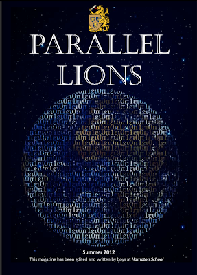
 Parallel Lions- Summer 2012
Above all, is the school logo, and under it is the mast head 'PARALLEL LIONS'. This gives inportance to the logo showing that it is a school magazine. It is very big, in capital letters but it isn't entirely bold because that would be too overpowering on the page.
The image on the front cover is of the world, made up by the Greek alphabet. This could symbolise the knowledge of the world, so this magazine isn't necessarily about people but about worldly issues or stories.
The same kind of colours are used but the colour that stands out and is different is the yellow of the school logo. This shows the significance of it.
There are two different fonts that are used on this front cover. One looks more formal and professional. The other is more of an understatement and is just there for information purposes.
Subscribe to:
Comments (Atom)


