Tuesday, 12 November 2013
My Evaluation
My media product uses the codes and conventions of a front cover because it has a set theme running through it, red, whit and black. This magazine is also unisex, which most aren't, but being a school magazine i feel that it had to appeal to both genders.
The institution that might distribute my media product would have to be the school (Highdown) because it is a magazine written for them by the students of that place. It could also be distributed around the local community, involving them in the schools activities and advertising the school so people would want to enroll.
The audience for my Magazine is mainly the senior school, since it is a mature and professional looking product but also relates to the students and isn't patronizing.
One of the ways we attract our audience is by the front cover, it is simple but not plain, and professional looking.
I have learnt how to use the basics of Photoshop, taking various pictures and how to create and write a blog.
Monday, 11 November 2013


Wednesday, 6 November 2013


Contents Page analysis- Vogue
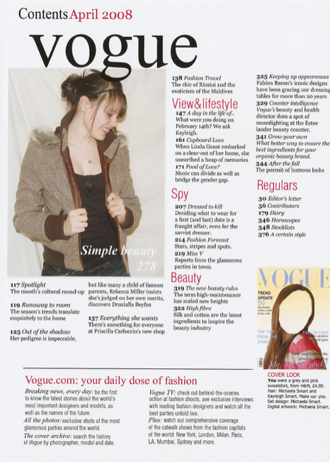
The thing that stands out on the contents page the most are the pictures, these are used to draw the readers attention visually. Although there are only two pictures, they show us who the audience is, women. The next thing that would catch the readers eyes would be the red sub-headings. The Different pages are split up into sub categories so that the reader can look for what they want to read quicker, which is more convenient.
It has a colour theme to it which it good because it looks organised and sophisticated. The colours arn't over girly either so it suggests that this is aimed at women and not girls.
Colour Testing

Yellow suggests optimism and happiness, this is because it is a bright colour and it resembles the colour of the sun and life. Some people might not like yellow because it is too bright therefore it might be hard to read.
Orange could symbolizes happiness and warmth and could also resemble the sun. It is a cheerful sociable colour, this could suggest that this is a very childish and child friendly.
Red symbolizes love and passion or danger and fire. it is often used on street signs. It stands out and is attention grabbing.
Light Red (Pink) is considered to be a very girly colour, often used for girls 16 and under. It is also another colour that is commonly used to symbloises love, compassion and nurturing. It has the power of red but softens it with the white.
Purple represents balance, the mixing of a hot/loud colour(red) and a cold/quiet colour(blue). It is an optimistic colour, symbolising happiness and contentment. It is a colour that could be applied to both genders, being feminine and masculine at the same time, appealing to everyone.
Green is the colour of growth, health and wealth. It is considered a male colour but can be either unisex dependsing on the shade of green. The mixing of Blue and Green makes Turquoise, a very desirable colour.
Thursday, 17 October 2013

Wednesday, 16 October 2013
Font testing for the School Magazine

American typewriter- This font is simple and easy to read, but not overly simple that it is patronising, therefore think this font would work well on the front of a secondary school student magazine.
Apple casual- This font is very simple and playful, but it is over simplified so putting it on a student magazine for secondary school students would be a bit patronising. It could be suited better to a primary school magazine because it would apply better to the age group.
Bank gothic- As this font is in all capitals and quite bold, it would make a good masthead for a magazine front cover. It is also well spaced out so it is easy to understand and read. However it looks quite rigid and boxy so it wouldn't look right on a student magazine front cover but rather a business magazine or computer magazine.
Bauhaus- This font is very simple and stylish in a way, it has an 'art deco' feel to it. It is evenly spaced out and very round. Because of its stylish nature I think it is more suited to a music or art magazine rather than a student magazine.
Brush script- This font mimics handwriting and therefore some people may not be able to understand it that well as it is quite small and not spaced out. So I do not think it would be a good font for the school magazine. It could suit other magazines for example a feminine one like women's fashion or a music or art magazine.
Mesquite std- This magazine has a cowboy theme to it because of its style. It is tightly spaced together so it is not easy to read but it is in all capitals so it could be used as a masthead for certain magazines for example a music magazine. I don't think it is suitable for a school magazine though.
Party LED- This is another font that is in a handwritten style but it is more spaced out but is maybe more difficult to understand because it is very curly and the lower case letters are quite small. It would suit a magazine with a Halloween feel to it but not a school magazine.
Desdemonda- This font has an 'Aztec' feel to it. It is in all capitals and evenly spaced out so it would make a good masthead. But it is not filled in so it wouldn't be very bold. I don't think it would be good as the magazine font for a school magazine.
Subscribe to:
Comments (Atom)